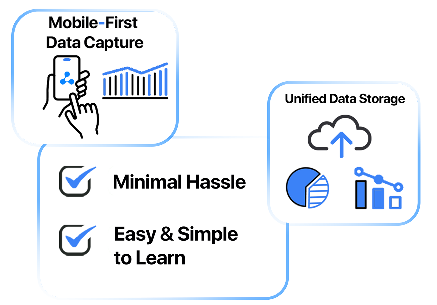
Aliquot: Built for the Way You Work Today
Faster, Streamlined, and Easier to Use
Continuous improvement is a core value at AquaPhoenix Scientific, one that often goes hand in hand with another core value: provide the best possible quality and experience for our customers.
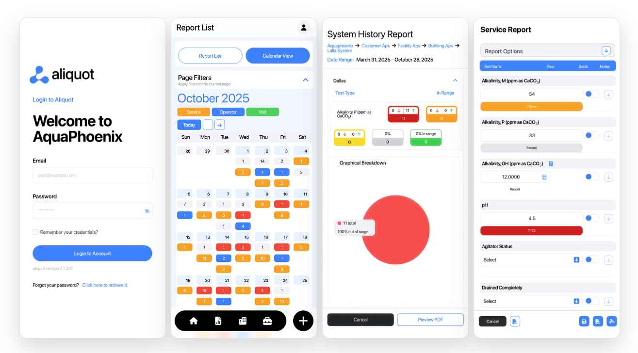
Our recent revamp of Aliquot, our cloud-based service reporting software, represents our ongoing commitment to continuous improvement and to making our customers’ daily work easier and more efficient. Aliquot represents our ongoing commitment to making your daily work easier, more intuitive, and more efficient. Over the last year, we’ve rebuilt and refined the platform with user feedback at the center of every design and engineering decision. The result is a software that feels familiar, yet noticeably more powerful – faster navigation, clearer reporting, streamlined setup, and modern performance across every device.
The evolution from our original platform to Aliquot wasn’t just an update. It was a thoughtful redesign based on how real users move through their workflows. Every feature was re-examined, simplified, and rebuilt to reduce friction and give you more control.
If you’d like a deeper look into how we approached the design and build process, from user interviews to interface testing, you can explore our full behind-the-scenes blog.
Meaningful Improvements That Matter
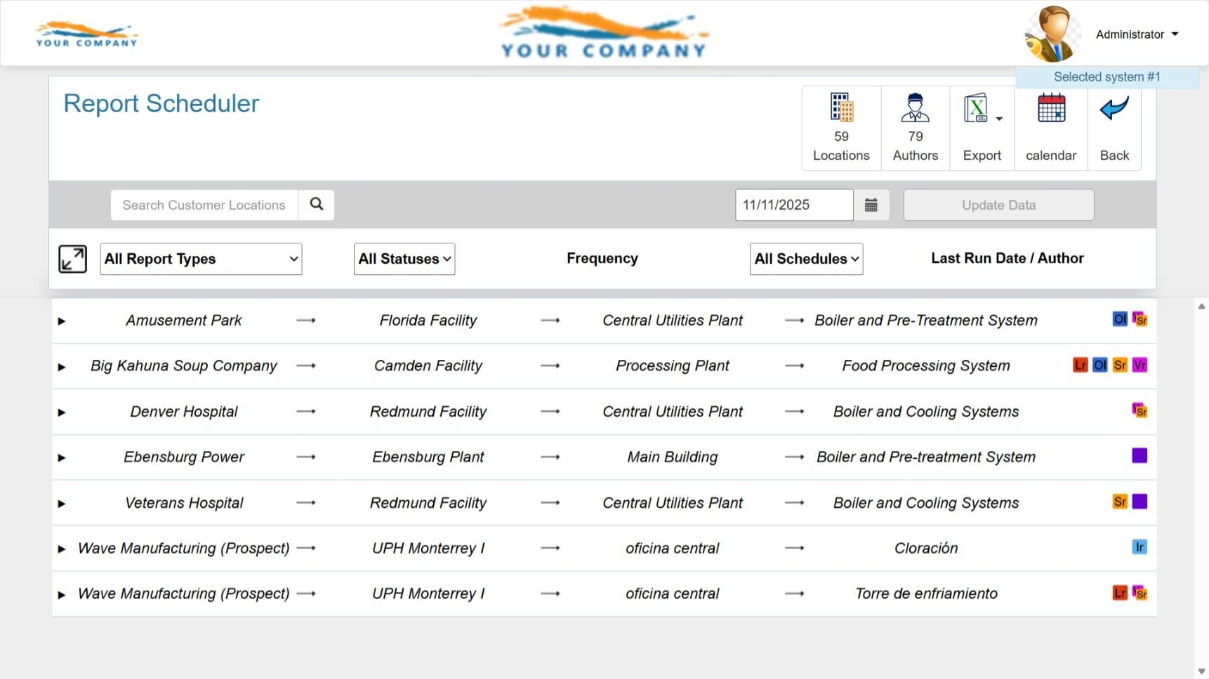
Navigation
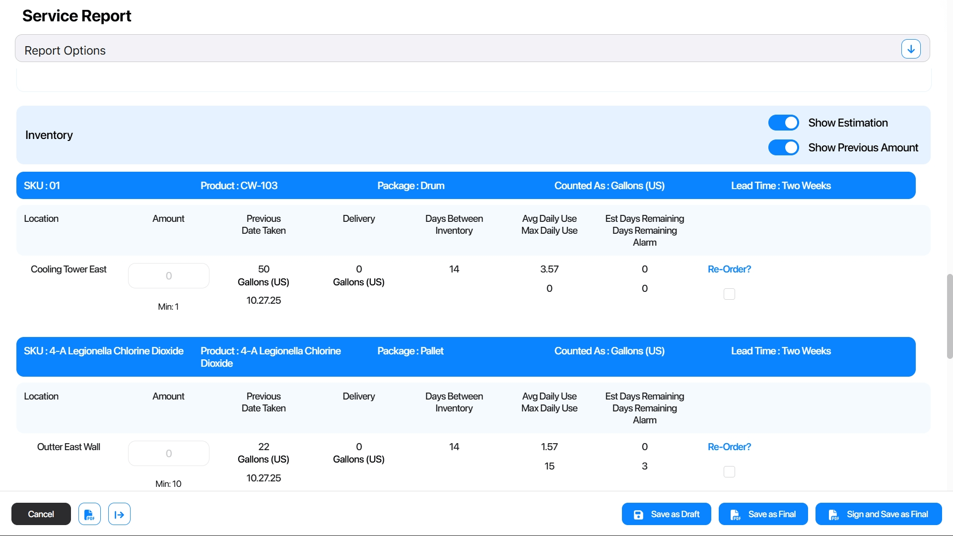
eService Reports:
Navigation required choosing a location first and repeating steps to switch contexts.
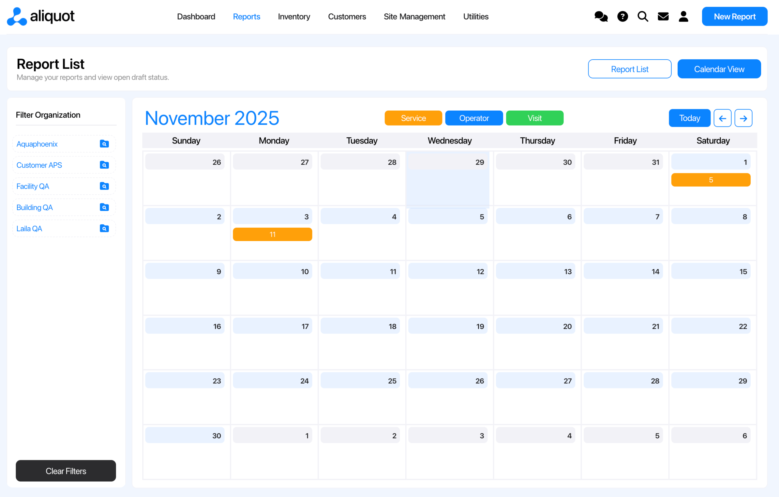
Aliquot Reports:
A persistent left-side hierarchy that stays out of the way but is always available. Switch locations at any time without leaving your current screen.
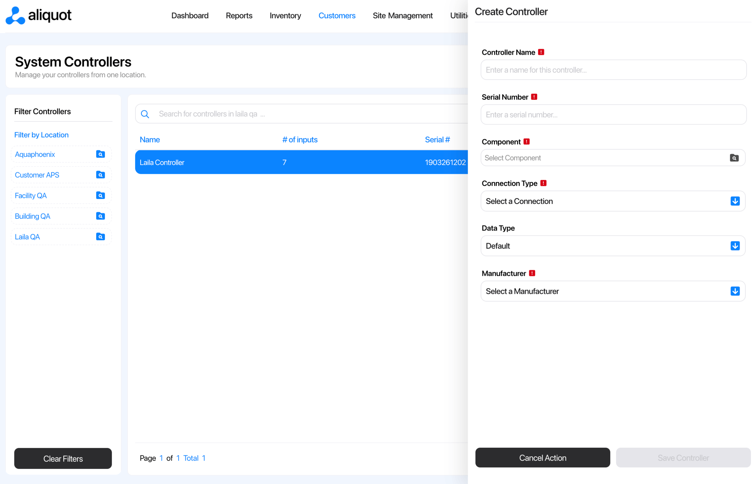
Inventory Setup
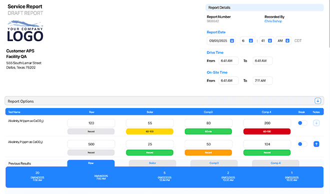
eService Reports:
Multiple assignment layers slowed down setup and maintenance.
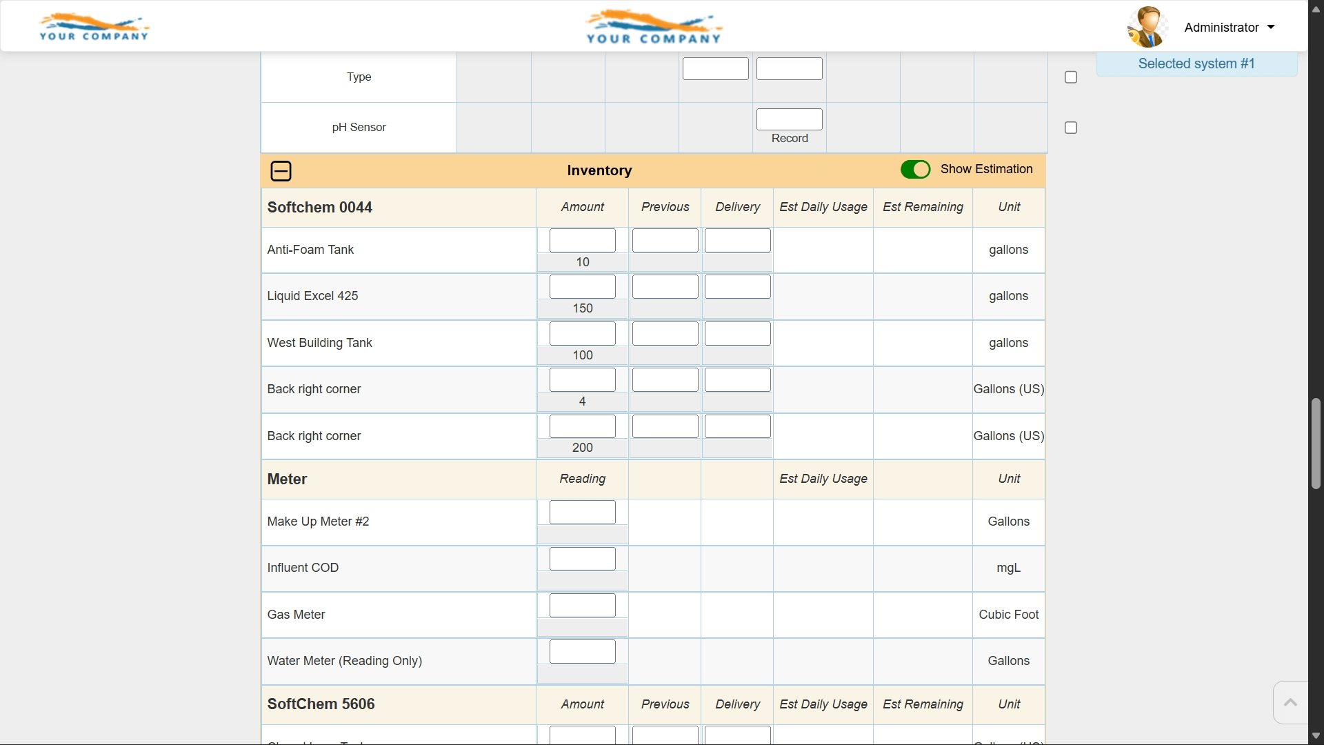
Aliquot Reports:
Add products once and immediately configure inventory at the system level. A simple two-step workflow.
Platform Speed
eService Reports:
Page loads and transitions could take several seconds.
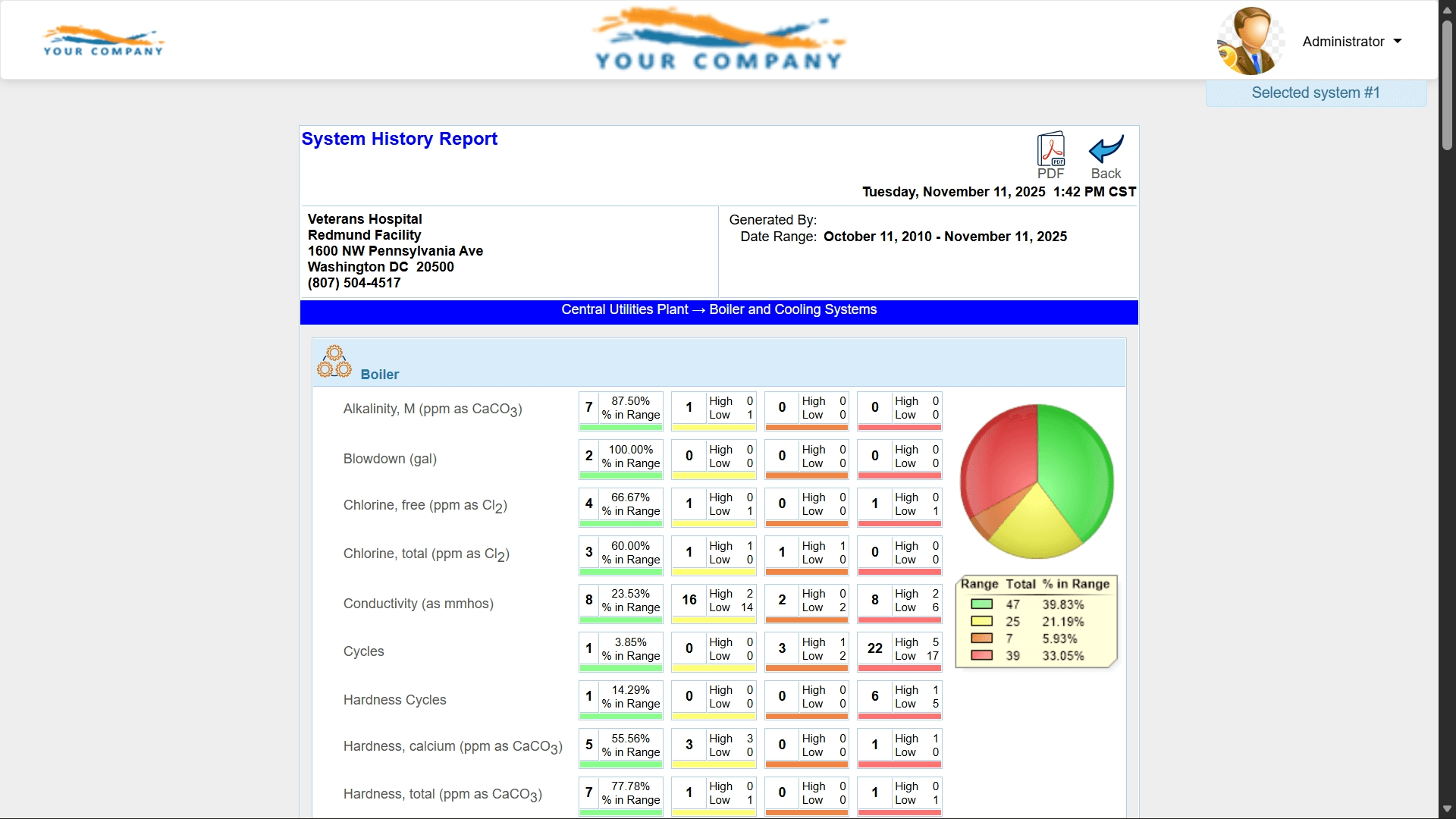
Aliquot Reports:
A modern architecture that treats anything slower than two seconds as a bug. Nearly instant responses across the platform.
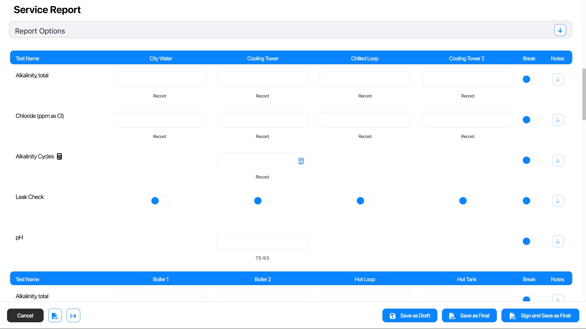
Components & Tests
eService Reports:
Creating or arranging tests required leaving the page and navigating across multiple areas.
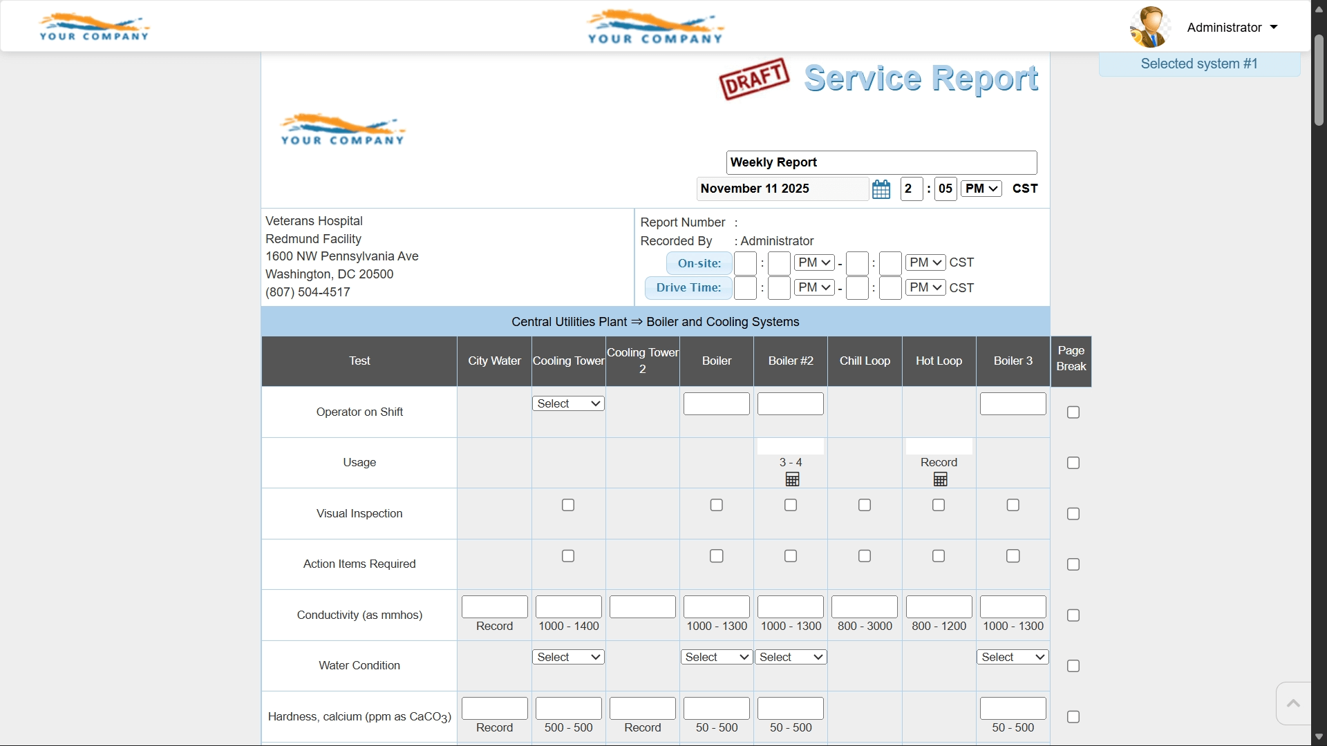
Aliquot Reports:
A single visual workflow that shows tests exactly as they appear on the report, with drag-and-drop ordering and quick additions.
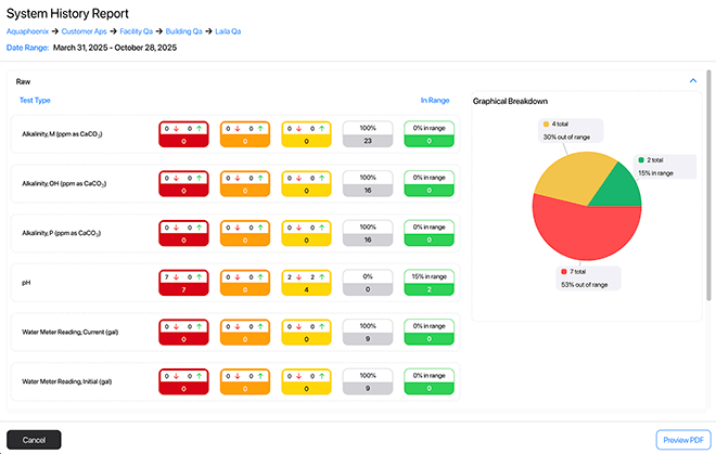
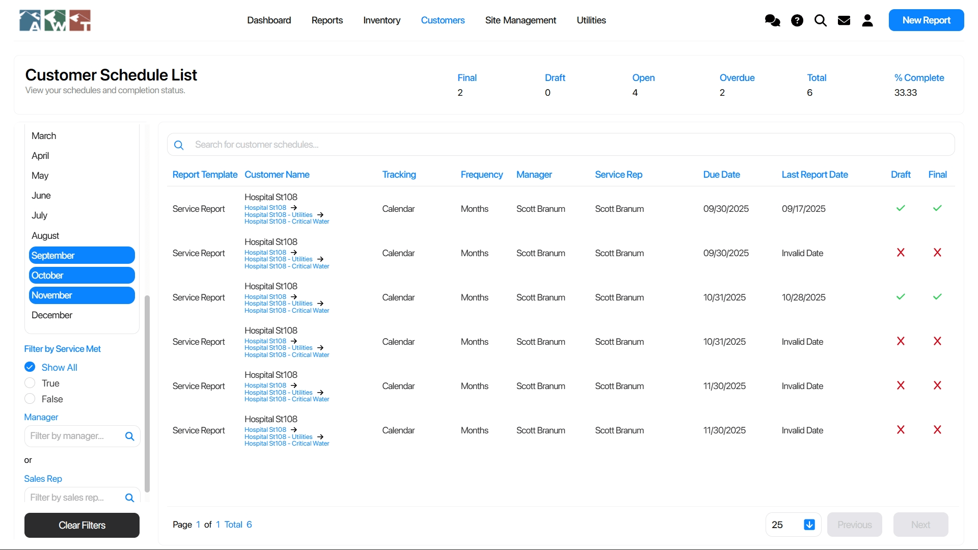
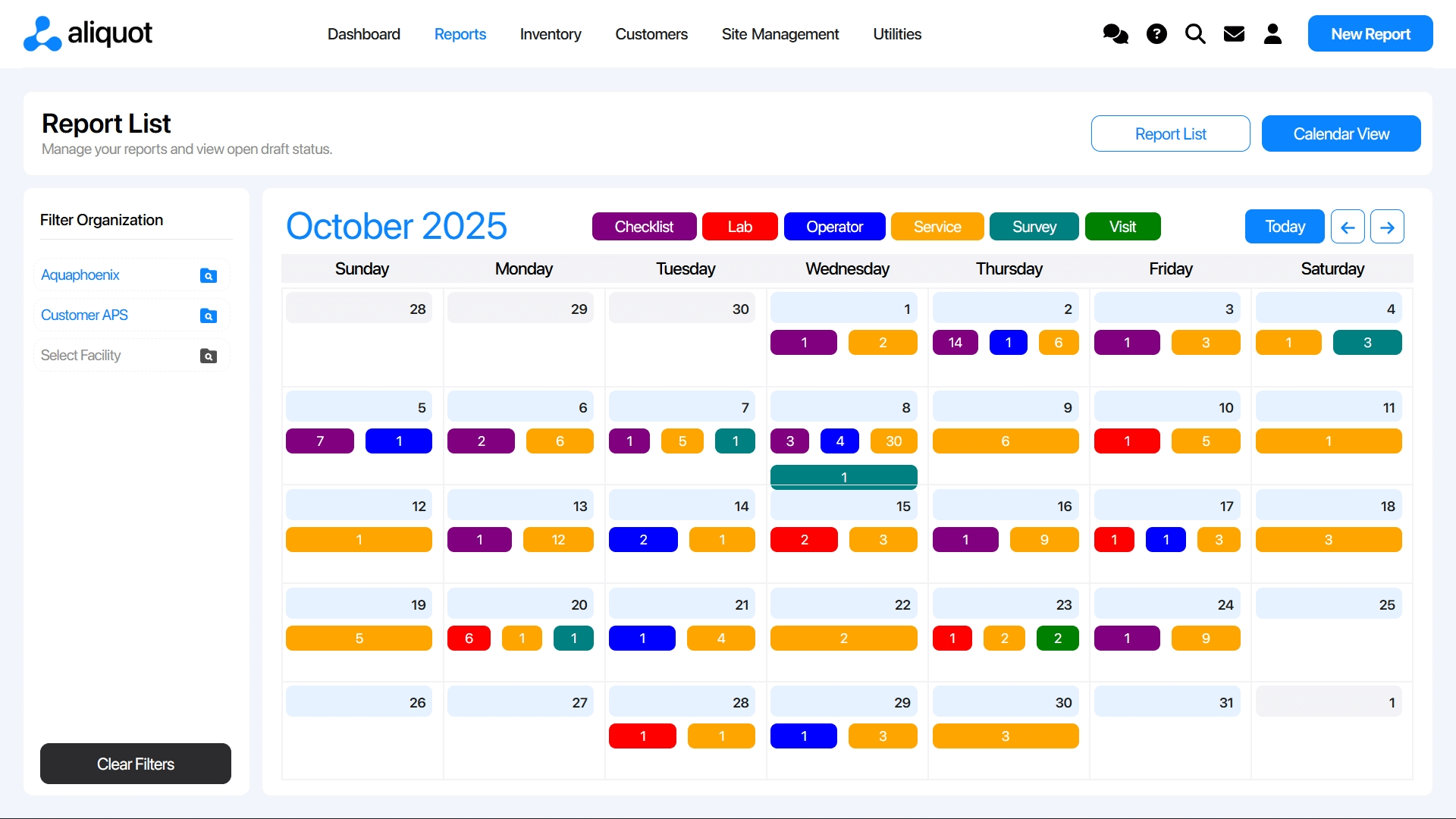
Report Management
eService Reports:
Reporting was split across various pages, making activity hard to view at a glance.
Aliquot Reports:
One comprehensive Report List combining drafts, finals, filters, system-level views, and calendar insights.
Mobile & Tablet Experience
eService Reports:
Workflows were desktop-only.
Aliquot Reports:
Fully responsive layouts for mobile and tablet, touch-friendly for in-field use on phones and iPads.
Multi-Tab Support
eService Reports:
Multiple browser tabs created conflicts.
Aliquot Reports:
Open as many tabs or windows as you want for a truly modern, flexible workflow.
Overall User Experience
eService Reports:
Workflows took more clicks and more time.
Aliquot Reports:
Cleaner visuals, intuitive interactions, fewer steps, and a modern design that users learn to use quickly, often in just a few days.